Push notifications have become a popular marketing channel since their inception in 2009 for iOS. Shortly afterward, it was quickly adopted by all major operating systems. Since then, push notifications have been at the forefront of reaching audiences with bite-sized updates for over a decade.
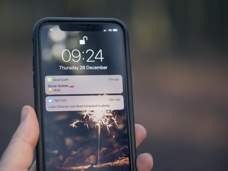
The wide OS support for push notifications also means it can be tricky to design push notifications for each of these platforms.
In this article, we are going to cover what push notifications are and how to design them. You will receive some valuable insight that will help you understand the design of a push notification by “dissecting its anatomy”.
So if you are a product owner and/or a designer trying to craft the perfect push notification to reel your readers in, then you’ve come to the right place.
Push notifications are short, clickable messages that let businesses interact with their customers on mobile and desktop devices. They are commonly used to provide the most up-to-date information, special offers, and promotions, as well as breaking news and live event updates.
Push notifications are permission-based and can be issued by an app or a website. The subscriber receives push notifications on their device once they have registered to the alerts, allowing them to remain up to speed with the latest information.
Even though app push notifications have been available for over a decade, different types of push notifications including web and Facebook Messenger alerts are still relatively young, despite that they have been greatly successful. They are commonly used in the marketing stack to make sure no aspect of audience engagement goes unnoticed.
Web push notifications appear different to users based on the operating system and the browser they are using. Here’s a breakdown of how push notifications look like in each of them.

a. Browser Icon: Chrome icon. This can’t be changed.
b. Title: Restricted to 20-40 characters.
c. Domain: Website user is subscribed to. Can’t be changed.
d. Content: Restricted to 20-80 characters.
e. Icon: 192x192 or larger. PNG, JPG, GIF (not animated).
Character limitations vary based on whether or not an icon is present and which characters are utilized. Two action buttons are also supported in Chrome for macOS.

a. Browser Icon: Firefox icon. This can’t be changed.
b. Title: Restricted to 60-80 characters.
c. Domain: Website user is subscribed to. Can’t be changed.
d. Content: Restricted to 20-80 characters.
e. Icon: 192x192 or larger. PNG, JPG, GIF (not animated).

a. Icon: This is set once and can’t be changed per individual message. Must be 256x256. PNG, JPG, GIF (not animated).
b. Title: Restricted to 40 characters.
c. Content: Restricted to 90 characters.
It's worth noting that Safari lacks a browser icon. It also doesn't show the domain.
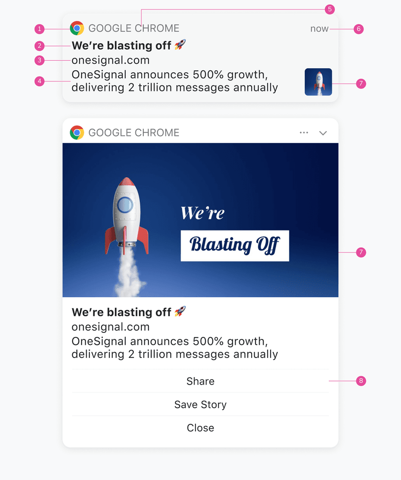
a. Browser Icon: Chrome icon. This can’t be changed.
b. Title: Restricted to 60-80 characters.
c. Domain: Website user is subscribed to. Can’t be changed.
d. Content: Restricted to 120-150 characters.
e. Browser: Can’t be changed.
f. Time Stamp: When the message was received.
g. Icon: 192x192 or larger. PNG, JPG, GIF (not animated). Enlarges when expanded.
h. Action Buttons: Supports up to 2 buttons.
Character limitations vary based on whether or not an icon is present and which characters are utilized. The primary differences between macOS Big Sur and previous versions are that messages may be enlarged with a bigger icon, and the browser icon is smaller, allowing for more content.
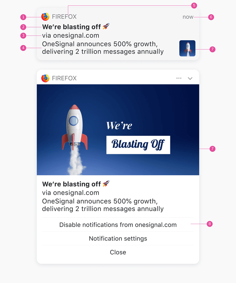
Browser Icon: Firefox icon. This can’t be changed.
Title: Restricted to 60-80 characters.
Domain: Website user is subscribed to. Can’t be changed.
Content: Restricted to 120-150 characters.
Browser: Can’t be changed.
Time Stamp: When the message was received.
Icon: 192x192 or larger. PNG, JPG, GIF (not animated). Enlarges when expanded.
Action Buttons: These cannot be customized for Firefox.
Character limitations vary based on whether or not an icon is present and which characters are utilized. The primary differences between macOS Big Sur and previous versions are that messages may be enlarged with a bigger icon, and the browser icon is smaller, allowing for more content.
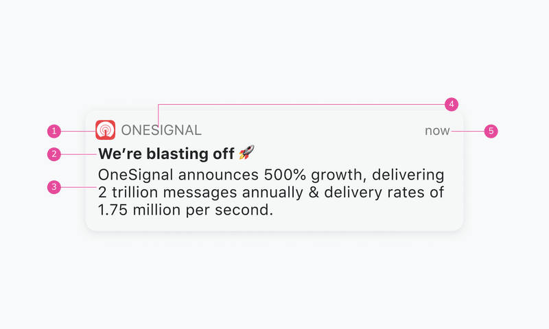
a. Icon: This is set once and can’t be changed per individual message. Must be 256x256. PNG, JPG, GIF (not animated).
b. Title: Restricted to 60-80 characters.
c. Content: Restricted to 120-150 characters.
d. Website Name: Can't be changed.
e. Time Stamp: When the message was received.
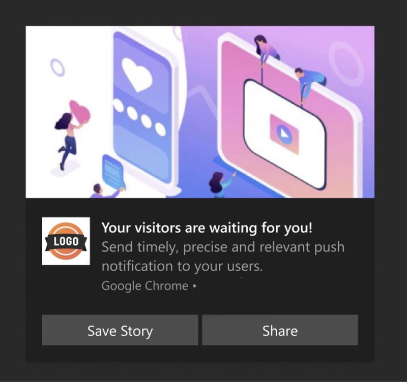
a. Icon: Logo, this can be changed. Needs to be square. Preferable 192*192 or large. Format supported JPEG, PNG, or GIF(not animated).
b. Title: Restricted to 60 characters.
c. Domain: Website user is subscribed, this can’t be changed.
d. Content: Restricted to 120 characters.
e. Browser Name: Chrome, can’t be changed.
f. Image: Needs to be a 2:1 ratio. Preferable 360*180. Format supported - JPEG, PNG, or GIF(not animated).
g. Action Buttons: Supports 2 action buttons.
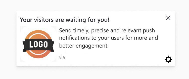
a. Icon: Logo, this can be changed. Needs to be square. Preferable 192*192 or large. Format supported JPEG, PNG, or GIF(not animated).
b. Title: Restricted to 40 characters.
c. Domain: Website user is subscribed, this can’t be changed.
d. Content: Restricted to 140–190 characters.
e. Settings: Can’t be changed or replaced.
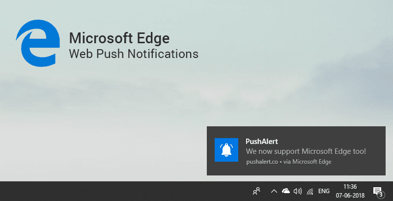
a. Title: Restricted to 40 characters.
b. Icon: 192x192 or larger. PNG, JPG, GIF (not animated).
c. Browser: Can't be changed.
d. Content: Restricted to 140-190 characters.
e. Domain: Website user is subscribed to. Can’t be changed.
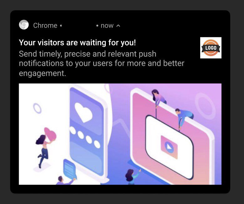
a. Browser Icon: Chrome, must be white with a transparent background. This can’t be changed. Needs to be square. Preferable 72*72 or large. Format supported PNG.
b. Logo Icon: Logo, this can be changed. Needs to be square. Preferable 192*192 or large. Format supported JPEG, PNG, or GIF(not animated).
c. Title: Restricted to 50 characters.
d. Domain: Website user is subscribed, this can’t be changed.
e. Content: Restricted to 150 characters.
f. Large Image: This is open to exploring. You can put the image as per the context of the notification. Needs to be a 2:1 aspect ratio. Preferable 1024*512. Format supported PNG, JPG, GIF (not animated).
g. Time Stamp: When the message was received.
Compared to web push notifications, mobile push notifications are less diverse in appearance. Here’s how push notifications look like on two major mobile platforms - Android and iOS.
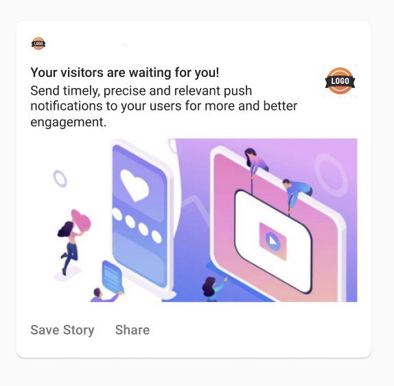
a. Small Icon: Logo, must be white with a transparent background. This can be changed. Needs to be square. Preferable 24*24–96*96 to fit all device sizes. Format supported - PNG.
b. Logo Icon: Logo, this can be changed. Needs to be square. Preferable 192*192 or large. Format supported JPEG, PNG, or GIF(not animated).
c. Title: Restricted to 50 characters.
d. App Name: This can’t be changed.
e. Content: Restricted to 150 characters.
f. Large Image: This is open to exploring. You can put the image as per the context of the notification. Needs to be a 2:1 aspect ratio. Preferable 1440*720. Format supported - PNG, JPG, GIF (not animated).
g. Action Buttons: Supports up to 3 actionable buttons.
h. Time Stamp: When the message is received.
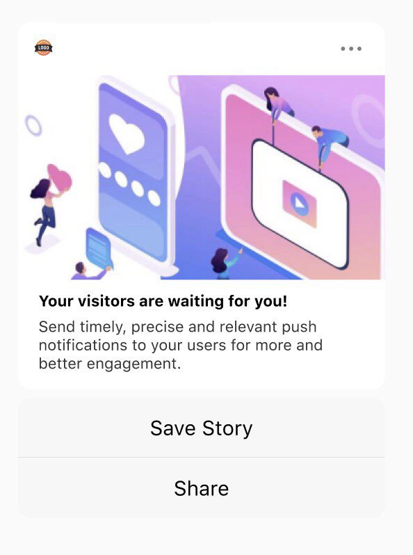
a. App Icon: Logo, this can’t be changed. Needs to be square. IOS uses the app’s default icon.
b. Title: Restricted to 25-50 characters.
c. App Name: This can’t be changed.
d. Content: Restricted to 150 characters.
e. Large Image: This is open to exploring. You can put the image as per the context of the notification. Needs to be a 1:1 aspect ratio. Preferable 1024*1024. Format supported - PNG, JPG, GIF, MP4, MP3, WAV.
f. Action Buttons: Supports up to 4 actionable buttons.
g. Options: The 3 dot option can’t be changed.
A subtitle is also supported on iOS. Note that, unlike Android, iOS does not presently allow web push.
Push notifications offer a ton of advantages that enable you to engage more viewers. Even still, they may prove to be counter-productive and reduce engagements. Here are some of the pros and cons of Push notifications.
Since you’ve come this far, we can assume that you’ve gained a rudimentary understanding of what a push notification is and how to design one. Now before you get started crafting the perfect push notification, here are some tips to help you along.
Making a push notification that truly signifies something is an art. You'll want to utilize a brief, direct message that offers people something to interact with. Good push notifications should do the following:
Push notifications should never be longer than the available screen space. Users can receive notifications on their phones (in various places), wearable devices (which take up less space), or desktop computers (larger space). You should design and compose the notification's text using the shortest space possible.
Picking the right tools to craft your push notification campaigns is a crucial step. It can help you optimize the performance of your campaigns easily and get maximum conversions.
When it comes to push notification tools designed for publishers, Monsy is a no-brainer. It allows you to easily capture your audience, and effectively market to them to grow your revenue across all platforms.
With Monsy, you’ll be able to earn more with Push Notifications, which take up little space on your website yet provide immediate revenue and compliment other placements.
You can boost your revenue with a simple straightforward banner that floats on either side of the page. This placement works on both mobile and desktop, allowing publishers to make more money.
Monsy works for all tiers and devices. It has the best results on mobile with the highest CTR and also is the top-performing ad for all GEO. Monsy truly is the one-stop solution to all your publishing needs.
An excessive number of alerts may be a dealbreaker for your users. However, if you send out too few alerts, the user may forget about your app or website. You'll need the perfect blend.
The best notifications are those that are welcome by the subscribers - such as, a reminder or breaking news.
Allowing consumers to personalize their push notification settings is an important aspect of the design. Users are less likely to be irritated by the outcome if they can control when and how many messages they receive.
Push notifications are one of the finest ways to engage your audience and increase your conversion rates. Hopefully, you now have an understanding of the inner workings of a push notification and how to craft the perfect one for your business and viewers.
However, it won’t matter how perfect your notification is if it’s sent out at the wrong time.
This is the final tip we have for you - time your notification right. If your notifications are sent out at a time when your audience isn’t paying attention, it’ll most likely be ignored. To avoid this issue, use Monsy to optimize your push notifications and grow your revenue by 85% with our top-performing ad formats.
Get started with Monsy today!