Web Push Notifications are a commonly utilized communication channel by organizations to reach out to potential consumers, engage them, and increase conversions. They assist in the distribution of critical promotional and non-promotional content from the brand to customers.

However, with so many push notifications being delivered to them, consumers may grow irritated. The obvious question that comes to mind is: How Does One Create Effective Push Notifications? What are the best web push notification practices?
If you have the same questions, you’ve come to the right place.
We have worked with many websites and compiled some of the best practices for web push notifications. In this article, you will learn how to incorporate these strategies in your campaign and see an uplift in user engagements and conversion rates.
Table Of Contents
- What Are Web Push Notifications?
- Difference Between Web & App Push Notifications
- Who Can Send Web Push Notifications?
- Web Push Notifications Best Practices To Get More Engagement
- 1. Opt-In Customization
- 2. Optimize Your Web Push Notification Timing
- 3. Target Audience Segmentation
- 4. Keep It Short & Simple
- 5. Localize Notifications
- 6. Use Rich Media & Images
- 7. Use Precise CTAs
- 8. Personalize Your Push Campaigns
- 9. Add Urgency For Faster Conversions
- 10. Use A/B Testing For Your Web Push Notifications
- 11. Do Not Spam Your Users Notifications
- Conclusion
What Are Web Push Notifications?
Web push notifications are alerts that may be sent to a user's desktop or mobile web browser.
These are alert-style messages that show in the top or bottom right-hand corner of a desktop screen, depending on the operating system, or appear on a mobile device in a way similar to app push notifications.
Web push notifications appear on a user's desktop or mobile screen while the browser is open, regardless of whether the user is on the website.
Difference Between Web & App Push Notifications
To deliver web push alerts, all you need is a website that has web push code loaded. This implies that even if a company doesn't have an app, it may make use of many of the benefits of push notifications (real-time, customized, in-the-moment messaging).
On the other hand, app push notifications are transmitted by a code that is installed in the app.
Who Can Send Web Push Notifications?
Web Push Notifications may be used by any website that wishes to re-engage consumers and increase traffic. You don't need an app to receive push notifications. A push notification is a re-engagement channel that is delivered directly to the user's browser.
It’s best to use web push notifications for marketing purposes.
Use push notifications to keep users informed about forthcoming sales, products, and other information. Avoid utilizing push notifications for any transactional-related updates since the user cannot store them.
If you want to get started, we highly recommend going with Monsy. It is compatible with all devices and has the top-performing ad formats in the business.
Web Push Notifications Best Practices To Get More Engagement
1. Opt-In Customization
CTRs for web push notifications are an important measure since they show how many people were drawn to your alert and opted to click on it. However, convincing consumers to opt-in is critical to the success of your approach.
Getting the opt-in right for web push notifications may be the difference between increasing online conversions and being blocked by consumers. The way you send web push notifications has changed as a result of Google's latest Quieter Permission UI.
Two-Step Opt-In
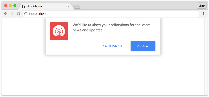
The recommended practice for getting consumers to consent to your web push notifications is to employ a two-step opt-in. It not only enhances the user experience but also provides more context for why consumers should grant notification access.
It prevents your website from being forced to show a quieter permission prompt if too many users opt-out of Google Chrome's standard native prompt.
You may use a two-step opt-in template to help people understand why you're asking for permission to send them alerts in the first place. After the user agrees, you may display a pop-up that instructs them to manually opt-in for alerts.
Delayed Opt-In
When prompted for permission as soon as they arrive on the website, the majority of users either block or opt-out permanently. Because of the improper timing, the permission prompts become quieter.
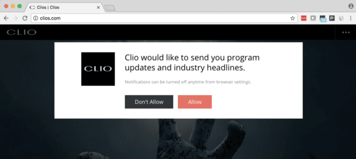
Improving user experience is one of the best methods to gain opt-in. After the consumer spends a particular amount of time on your website, add a delay and activate your opt-in screen. This will enhance your website's user experience by reducing rapid opt-outs.
Reminder Template
A large number of users may be automatically enrolled in the quieter permissions UI. Users will need some time to figure out how to re-opt-in to get web push alerts in this scenario.
A user can be prompted and guided through the process of activating permissions and electing to receive push notifications using an opt-in reminder template. Users who have already disabled opt-ins can be reminded through this template.
Bell Icon
The bell icon is a floating interactive and helpful button that allows your users to modify their notification permissions. When users click the bell symbol, they will be sent to either an opt-in screen or an instruction screen that will show them how to opt-in.
Seek Permissions
It's critical for marketers to get opt-in consent on the correct page — that is, the one with the greatest traffic and where consumers are most engaged.
If a firm asks for opt-in authorization on its home page but user engagement is highest on its product page, for example, push notification subscribers will be limited.
Marketers must figure out where the majority of traffic is going and request push notification approval on those pages. These could be the homepage, success page, or product page.
2. Optimize Your Web Push Notification Timing
For effective web push campaigns, the timing of your push notifications is critical. If you don't pay attention, you may end up with poor CTRs and people opting out of your alerts. Before sending your alerts, make sure you've taken care of the following two things:
Time Zones
Users frequently complain about alerts arriving at inconvenient hours, such as late at night or early in the morning. Nobody wants their phone to ring in the middle of the night while they are attempting to sleep or are already asleep.
Create a section based on user time zones to guarantee that your alerts are received at a time that is convenient for your users all over the world.
Periods Of High Activity
As a marketer, you want your push notifications to have the best possibility of engaging your consumers and generating high CTRs.
Every client has a regular schedule, which makes it challenging to get your alerts noticed and clicked at the appropriate moments. Knowing if your target audience is more active in the morning or evening might help you determine the best time to deliver web push notifications for more interaction.
You may target people when they are most likely to be engaged and click your alerts by optimizing your send times.
3. Target Audience Segmentation
In any marketing plan, segmenting your target demographic is crucial. Your user base may be segmented into target groups based on a variety of factors. You may work independently with each set of consumers and their interests using this strategy.
Sort your users into groups and give them appropriate alerts based on their behaviors or characteristics. Your segments should be based on the following criteria to get the most out of your web push notification campaign:
- Your users' browsing history.
- The users' purchasing history.
- Gender, city, nation, age, device, OS, and other user attributes.
4. Keep It Short & Simple
Always keep in mind that your consumers are bombarded with push notifications daily. Depending on the number of applications installed on their device, their notification center is inundated with notifications from various sectors. In this flurry, it's easy for your push alerts to get lost.
Keep your notification titles and descriptions brief and straightforward to cut through the clutter.
The lower the CTRs, the longer the notice header and content. To guarantee that the most amount of visitors interact and land on your website or product page, keep your notifications to 5–8 words in length.
5. Localize Notifications
Localization puts you one step ahead of the competition when it comes to customization. To provide a customized user experience, use location-based targeting.
Target users by their nation with smart segmentation and send web push notifications in their preferred or native language. This level of localization is critical for increasing CTRs and increasing client loyalty.
6. Use Rich Media & Images
It's possible that users will not always click on your alerts. In this situation, using images to convey your message helps you achieve your advertising objectives.
Adding photos to your notifications will make them more visually appealing and provide consumers with a context for what they're clicking on, as well as a better understanding of the notifications' purpose.
7. Use Precise CTAs
Checking your click-through rate is the greatest approach to determine the instant success of your web push notifications (CTR). It becomes tough to reach your marketing goal if your users do not click on your push notifications.
Incorporating a call to action (CTA) button into your alerts is one method to help boost your CTRs.
CTAs are essential in every aspect of marketing. Users must be urged to take action that is related to your objectives while they consume information. Giving your users a defined objective to achieve increases engagement and conversion rates.
8. Personalize Your Push Campaigns
Knowing and understanding your users' activities and habits is useless unless you can put the information to good use. When generating a push notification, make sure the message is relevant to your user.
Create more tailored campaigns with smart segmentation and unique characteristics that are more likely to resonate with your visitors and lead to a return visit to your website.
Setting up different custom characteristics allows for easy personalization. You may use them to include dynamic components in your alerts, such as a user's initial name, a product picture, and a link to the product page.
9. Add Urgency For Faster Conversions
Users will respond and act fast when they perceive a sense of urgency or shortage. Incorporate a sense of urgency into your alerts by stating how long the product/sale will be available. It optimizes the possibilities of conversion by increasing open rates.
Notification names that elicit a sense of urgency and excitement are more likely to be clicked, resulting in a high CTR. If there is a coupon code, you may also enter it in the same box.
10. Use A/B Testing For Your Web Push Notifications
Set up A/B tests to examine different aspects of your web push notifications. A/B testing is one of the most effective strategies to increase KPIs like click-through rates and conversion rates.
When it comes to web push subscribers, don't rely on guesswork - try different headlines, action buttons, body content, and more to see what works best.
A/B testing works best when only one piece is changed at a time. For example, test two different headlines while keeping the remainder of your notice the same. If one notice performs better than the others, you can be sure it's due to the headline change.
You won't be able to tell what sparked an increase in performance if you test several components at once.
11. Do Not Spam Your Users Notifications
This is perhaps the most important piece of advice on this list. Do not spam your users with notifications. Marketers who utilize a sophisticated web push funnel structure and often send bulk pushes risk bombarding their customers with notifications.
Spamming may have unfavorable consequences. Users may become annoyed by the constant buzzing of their phones' alerts and choose to either block or ignore them. Companies' push notification click-through rates will be reduced in the long term as a result of this.
Marketers may use frequency limiting to reduce the number of daily alerts they send to their customers. It may be configured to send any number of notifications at any time. It allows your business to be visible to customers without annoying them.
Conclusion
Always keep in mind that there is no one-size-fits-all solution. It's critical to keep your users in mind while developing your push notification strategy and to experiment with the names of your push notification campaigns regularly.
Experimenting with your content and discovering the perfect keywords that resonate with your visitors is also critical. You must adapt your strategy to changing trends.
Want to optimize your web push notifications and get a head start? Sign up with Monsy today!
Push notifications have become a popular marketing channel since their inception in 2009 for iOS. Shortly afterward, it was quickly adopted by all major operating systems. Since then, push notifications have been at the forefront of reaching audiences with bite-sized updates for over a decade.
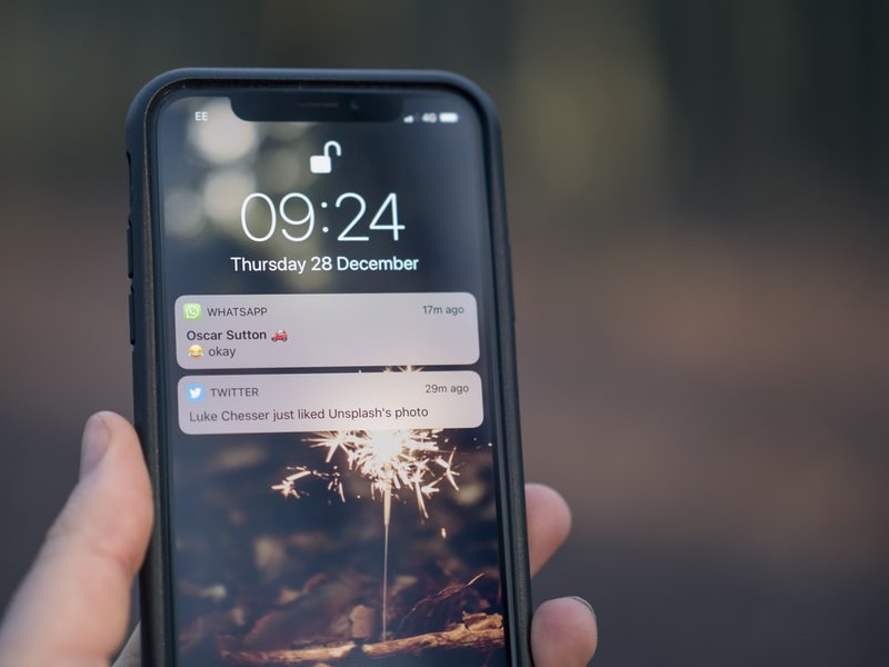
The wide OS support for push notifications also means it can be tricky to design push notifications for each of these platforms.
In this article, we are going to cover what push notifications are and how to design them. You will receive some valuable insight that will help you understand the design of a push notification by “dissecting its anatomy”.
So if you are a product owner and/or a designer trying to craft the perfect push notification to reel your readers in, then you’ve come to the right place.
Table Of Contents
- What is a Push Notification?
- Anatomy of Push Notifications
- Web Push Notifications
- Mobile Push Notifications
- Advantages & Disadvantages of Push Notifications
- Tips For Making The Most Of Push Notifications
- Push Notifications Tip #1: Keep it Short & Direct
- Push Notifications Tip #2: Use The Right Tool
- Push Notifications Tip #3: Figure Out The Perfect Amount Of Notifications To Send
- Final Thoughts
What is a Push Notification?
Push notifications are short, clickable messages that let businesses interact with their customers on mobile and desktop devices. They are commonly used to provide the most up-to-date information, special offers, and promotions, as well as breaking news and live event updates.
Push notifications are permission-based and can be issued by an app or a website. The subscriber receives push notifications on their device once they have registered to the alerts, allowing them to remain up to speed with the latest information.
Even though app push notifications have been available for over a decade, different types of push notifications including web and Facebook Messenger alerts are still relatively young, despite that they have been greatly successful. They are commonly used in the marketing stack to make sure no aspect of audience engagement goes unnoticed.
Anatomy of Push Notifications
Web Push Notifications
Web push notifications appear different to users based on the operating system and the browser they are using. Here’s a breakdown of how push notifications look like in each of them.
Mac-Chrome (Catalina)

a. Browser Icon: Chrome icon. This can’t be changed.
b. Title: Restricted to 20-40 characters.
c. Domain: Website user is subscribed to. Can’t be changed.
d. Content: Restricted to 20-80 characters.
e. Icon: 192x192 or larger. PNG, JPG, GIF (not animated).
Character limitations vary based on whether or not an icon is present and which characters are utilized. Two action buttons are also supported in Chrome for macOS.
Mac-Firefox (Catalina)

a. Browser Icon: Firefox icon. This can’t be changed.
b. Title: Restricted to 60-80 characters.
c. Domain: Website user is subscribed to. Can’t be changed.
d. Content: Restricted to 20-80 characters.
e. Icon: 192x192 or larger. PNG, JPG, GIF (not animated).
Mac-Safari (Catalina)

a. Icon: This is set once and can’t be changed per individual message. Must be 256x256. PNG, JPG, GIF (not animated).
b. Title: Restricted to 40 characters.
c. Content: Restricted to 90 characters.
It's worth noting that Safari lacks a browser icon. It also doesn't show the domain.
Mac-Chrome (Big Sur)
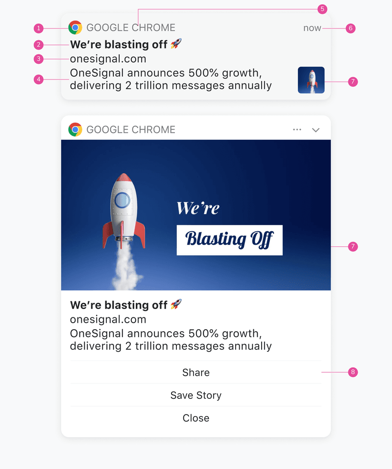
a. Browser Icon: Chrome icon. This can’t be changed.
b. Title: Restricted to 60-80 characters.
c. Domain: Website user is subscribed to. Can’t be changed.
d. Content: Restricted to 120-150 characters.
e. Browser: Can’t be changed.
f. Time Stamp: When the message was received.
g. Icon: 192x192 or larger. PNG, JPG, GIF (not animated). Enlarges when expanded.
h. Action Buttons: Supports up to 2 buttons.
Character limitations vary based on whether or not an icon is present and which characters are utilized. The primary differences between macOS Big Sur and previous versions are that messages may be enlarged with a bigger icon, and the browser icon is smaller, allowing for more content.
Mac-Firefox (Big Sur)
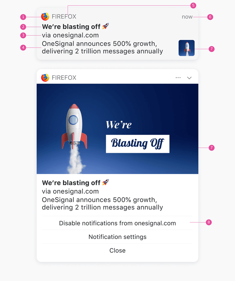
Browser Icon: Firefox icon. This can’t be changed.
Title: Restricted to 60-80 characters.
Domain: Website user is subscribed to. Can’t be changed.
Content: Restricted to 120-150 characters.
Browser: Can’t be changed.
Time Stamp: When the message was received.
Icon: 192x192 or larger. PNG, JPG, GIF (not animated). Enlarges when expanded.
Action Buttons: These cannot be customized for Firefox.
Character limitations vary based on whether or not an icon is present and which characters are utilized. The primary differences between macOS Big Sur and previous versions are that messages may be enlarged with a bigger icon, and the browser icon is smaller, allowing for more content.
Mac-Safari (Big Sur)
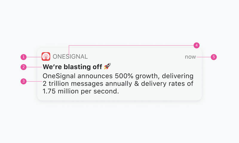
a. Icon: This is set once and can’t be changed per individual message. Must be 256x256. PNG, JPG, GIF (not animated).
b. Title: Restricted to 60-80 characters.
c. Content: Restricted to 120-150 characters.
d. Website Name: Can't be changed.
e. Time Stamp: When the message was received.
Windows-Chrome
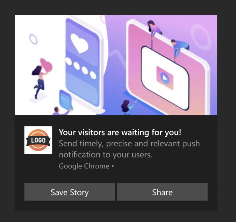
a. Icon: Logo, this can be changed. Needs to be square. Preferable 192*192 or large. Format supported JPEG, PNG, or GIF(not animated).
b. Title: Restricted to 60 characters.
c. Domain: Website user is subscribed, this can’t be changed.
d. Content: Restricted to 120 characters.
e. Browser Name: Chrome, can’t be changed.
f. Image: Needs to be a 2:1 ratio. Preferable 360*180. Format supported - JPEG, PNG, or GIF(not animated).
g. Action Buttons: Supports 2 action buttons.
Windows-Firefox
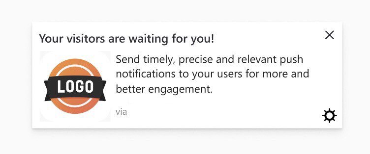
a. Icon: Logo, this can be changed. Needs to be square. Preferable 192*192 or large. Format supported JPEG, PNG, or GIF(not animated).
b. Title: Restricted to 40 characters.
c. Domain: Website user is subscribed, this can’t be changed.
d. Content: Restricted to 140–190 characters.
e. Settings: Can’t be changed or replaced.
Windows-Edge
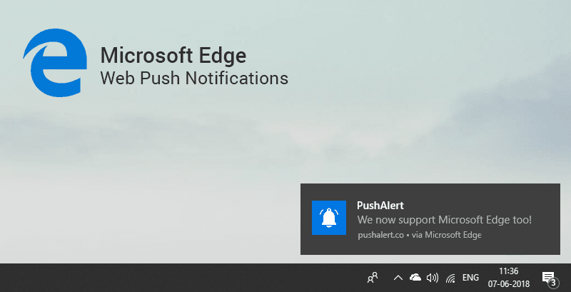
a. Title: Restricted to 40 characters.
b. Icon: 192x192 or larger. PNG, JPG, GIF (not animated).
c. Browser: Can't be changed.
d. Content: Restricted to 140-190 characters.
e. Domain: Website user is subscribed to. Can’t be changed.
Android-Chrome
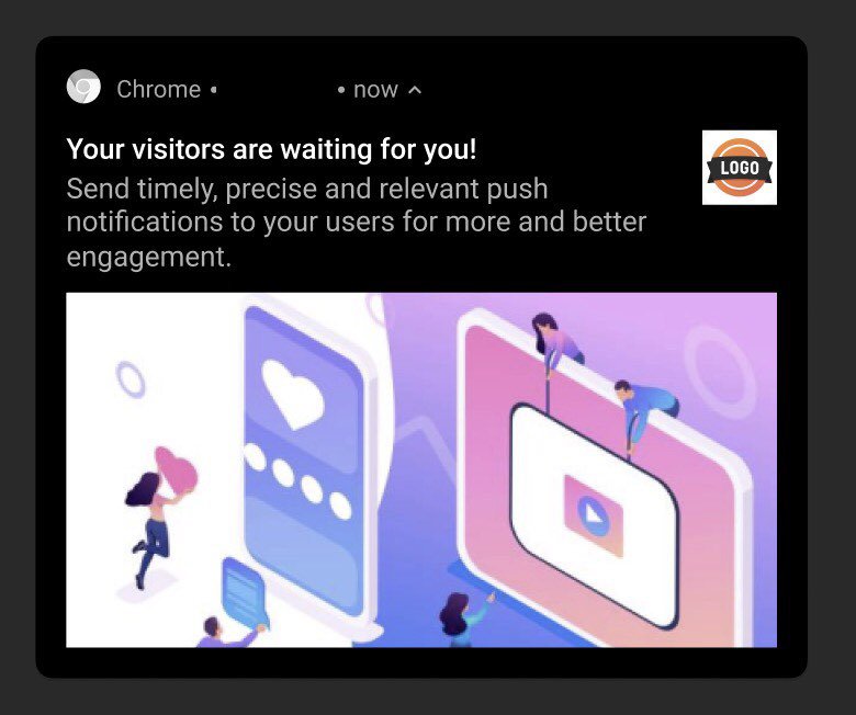
a. Browser Icon: Chrome, must be white with a transparent background. This can’t be changed. Needs to be square. Preferable 72*72 or large. Format supported PNG.
b. Logo Icon: Logo, this can be changed. Needs to be square. Preferable 192*192 or large. Format supported JPEG, PNG, or GIF(not animated).
c. Title: Restricted to 50 characters.
d. Domain: Website user is subscribed, this can’t be changed.
e. Content: Restricted to 150 characters.
f. Large Image: This is open to exploring. You can put the image as per the context of the notification. Needs to be a 2:1 aspect ratio. Preferable 1024*512. Format supported PNG, JPG, GIF (not animated).
g. Time Stamp: When the message was received.
Mobile Push Notifications
Compared to web push notifications, mobile push notifications are less diverse in appearance. Here’s how push notifications look like on two major mobile platforms - Android and iOS.
Native-Android
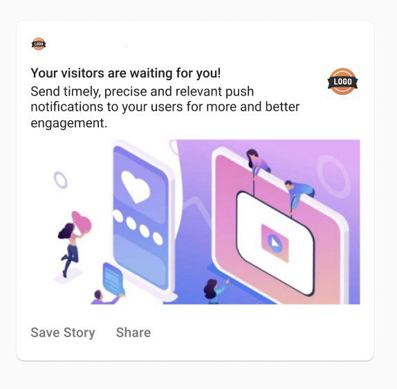
a. Small Icon: Logo, must be white with a transparent background. This can be changed. Needs to be square. Preferable 24*24–96*96 to fit all device sizes. Format supported - PNG.
b. Logo Icon: Logo, this can be changed. Needs to be square. Preferable 192*192 or large. Format supported JPEG, PNG, or GIF(not animated).
c. Title: Restricted to 50 characters.
d. App Name: This can’t be changed.
e. Content: Restricted to 150 characters.
f. Large Image: This is open to exploring. You can put the image as per the context of the notification. Needs to be a 2:1 aspect ratio. Preferable 1440*720. Format supported - PNG, JPG, GIF (not animated).
g. Action Buttons: Supports up to 3 actionable buttons.
h. Time Stamp: When the message is received.
Native-iOS
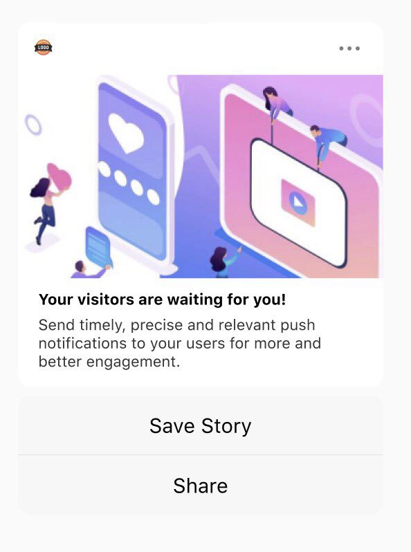
a. App Icon: Logo, this can’t be changed. Needs to be square. IOS uses the app’s default icon.
b. Title: Restricted to 25-50 characters.
c. App Name: This can’t be changed.
d. Content: Restricted to 150 characters.
e. Large Image: This is open to exploring. You can put the image as per the context of the notification. Needs to be a 1:1 aspect ratio. Preferable 1024*1024. Format supported - PNG, JPG, GIF, MP4, MP3, WAV.
f. Action Buttons: Supports up to 4 actionable buttons.
g. Options: The 3 dot option can’t be changed.
A subtitle is also supported on iOS. Note that, unlike Android, iOS does not presently allow web push.
Advantages & Disadvantages of Push Notifications
Push notifications offer a ton of advantages that enable you to engage more viewers. Even still, they may prove to be counter-productive and reduce engagements. Here are some of the pros and cons of Push notifications.
Pros
- Higher Visibility - Push notifications are customized alerts that appear in the corner of a user's browser window, making them extremely visible.
- Higher Conversion Rates - Push notifications have a 7X higher CTR than emails due to their high exposure.
- Optimized - Push notifications and their opt-in options may be tailored to fit the style and theme of a website. They are sent immediately and can also be scheduled for delivery at a later time.
- Reliable Revenue Source - Push notifications not only increase website traffic but also increase ad click-through rates. More and more media businesses are turning to this new stable revenue source, which allows you to monetize your 100% owned audience (subscribers).
Cons
- Interruptive & Annoying - Push notifications are sent in the same way as a pop-up ad, which makes them annoying. While this may work for a company that has clearly established when it will send alerts, it does not always provide a pleasant user experience.
- May become Spam - According to recent research, users receive about 80 alerts each day on average, which is staggering. Imagine your phone blowing up, only to realize you’ve received a dozen notifications about a topic you have no interest in. Annoying, right? Push notifications, which are typically one of the best methods to keep your loyal consumers engaged, must be used responsibly by businesses.
Tips For Making The Most Of Push Notifications
Since you’ve come this far, we can assume that you’ve gained a rudimentary understanding of what a push notification is and how to design one. Now before you get started crafting the perfect push notification, here are some tips to help you along.
Push Notifications Tip #1: Keep it Short & Direct
Making a push notification that truly signifies something is an art. You'll want to utilize a brief, direct message that offers people something to interact with. Good push notifications should do the following:
- Convey an interesting message to the user in a concise way.
- Allow the user to learn more while keeping in mind that many people will never look past the initial message.
- Remind the user of the app from which the message originated (for customer loyalty and branding).
Push notifications should never be longer than the available screen space. Users can receive notifications on their phones (in various places), wearable devices (which take up less space), or desktop computers (larger space). You should design and compose the notification's text using the shortest space possible.
Push Notifications Tip #2: Use The Right Tool
Picking the right tools to craft your push notification campaigns is a crucial step. It can help you optimize the performance of your campaigns easily and get maximum conversions.
When it comes to push notification tools designed for publishers, Monsy is a no-brainer. It allows you to easily capture your audience, and effectively market to them to grow your revenue across all platforms.
With Monsy, you’ll be able to earn more with Push Notifications, which take up little space on your website yet provide immediate revenue and compliment other placements.
You can boost your revenue with a simple straightforward banner that floats on either side of the page. This placement works on both mobile and desktop, allowing publishers to make more money.
Monsy works for all tiers and devices. It has the best results on mobile with the highest CTR and also is the top-performing ad for all GEO. Monsy truly is the one-stop solution to all your publishing needs.
Push Notifications Tip #3: Figure Out The Perfect Amount Of Notifications To Send
An excessive number of alerts may be a dealbreaker for your users. However, if you send out too few alerts, the user may forget about your app or website. You'll need the perfect blend.
The best notifications are those that are welcome by the subscribers - such as, a reminder or breaking news.
Allowing consumers to personalize their push notification settings is an important aspect of the design. Users are less likely to be irritated by the outcome if they can control when and how many messages they receive.
Final Thoughts
Push notifications are one of the finest ways to engage your audience and increase your conversion rates. Hopefully, you now have an understanding of the inner workings of a push notification and how to craft the perfect one for your business and viewers.
However, it won’t matter how perfect your notification is if it’s sent out at the wrong time.
This is the final tip we have for you - time your notification right. If your notifications are sent out at a time when your audience isn’t paying attention, it’ll most likely be ignored. To avoid this issue, use Monsy to optimize your push notifications and grow your revenue by 85% with our top-performing ad formats.
Get started with Monsy today!